Here's a bonkers story which appeared on the news wires this week. It concerns 39-year-old musician Nathan Smith, who supposedly used Google Maps to help find a buried treasure along the Texas Gulf coast.
Smith is in court trying to lay claim to the find, which may contain a boat lost in 1822 during a hurricane that was filled with silver and gold.
MG Siegler, blogging on the tech website Venture Beat, writes:
...That, in and of itself would be a great story, but that’s hardly the most interesting part. First of all, Smith, who is also a filmmaker that makes documentaries about conspiracy theories surround the terrorist attacks of 9/11, says he hasn’t made a profit from his artistic endeavors since 1990. Instead, he looks for investors to fund his treasure hunting, which would in turn fund his life as an artist.
Second, he got the idea to become a treasure hunter after seeing the movie National Treasure.
Third, Smith says that half of the crew died in the shipwreck, while the other half were eaten by the local cannibal tribe.
Fourth, Smith estimates that there is $3 billion in buried treasure in the spot that he’s trying to claim.
I bet you didn’t think finding a buried treasure on Google Maps would be the normal part of the story. But something tells me Smith is just trying to get his story sold as the plot for National Treasure 3.
Read the full account of Smith's day in court on the Houston Chronicle site here It doesn't get much stranger!
Oh, and a Happy New Year to everyone!
Wednesday 31 December 2008
Monday 29 December 2008
Panther sightings on the rise
Hi there map lovers!
Hope you had a great Christmas, and that you enjoyed tracking Santa across the world's skies. Back down to earth, and here in Florida we have had some exciting news regarding the native panther and the rise in sightings of this big cat.
The Interagency Florida Panther Response Team annual report: 2007-2008 offers some really encouraging news of the increase in panther-human interaction, which at least means the repopulation program is working. Check out the link here to read the report, and check out the actual satellite images recording the sightings and what happened where and when.
The one below shows human-panther conflicts in the Naples area, including one confirmed encounter in the past year.

Wednesday 24 December 2008
Norad still tracking Santa's journey
Hello there map lovers!
Are you keeping track of Santa Claus as he makes his way towards Florida? If not you need to get on the Norad site quick, he's on his way and has already checked his list once ...
If you don't believe me, watch this video of the big guy arriving in Auckland, New Zealand. They already have their gifts, lucky Kiwis!
Keep going back to the Norad site here to see where he is. And don't forget to leave out some cookies and milk for Rudolph and the other reindeer.
Here's some information from the Norad website on why exactly they track Santa every year.
For more than 50 years, NORAD and its predecessor, the Continental Air Defense Command (CONAD) have tracked Santa’s Christmas Eve flight.
The tradition began in 1955 after a Colorado Springs-based Sears Roebuck & Co. advertisement for children to call Santa misprinted the telephone number. Instead of reaching Santa, the phone number put kids through to the CONAD Commander-in-Chief's operations "hotline." The Director of Operations at the time, Colonel Harry Shoup, had his staff check radar for indications of Santa making his way south from the North Pole. Children who called were given updates on his location, and a tradition was born. To listen to Colonel Shoup talk about the experience, click here.
In 1958, the governments of Canada and the United States created a bi-national air defense command for North America called the North American Aerospace Defense Command, also known as NORAD. NORAD inherited the tradition of tracking Santa.
Since that time, NORAD men, women, family and friends have selflessly volunteered their time to personally respond to Christmas Eve phone calls and emails from children. In addition, we now track Santa using the internet. Last year, millions of people who wanted to know Santa's whereabouts visited the NORAD Tracks Santa website.
Merry Christmas everybody!
Monday 22 December 2008
A quick reminder...
Hi there map fans!
Take a look at this weather map from the good folks at weather.com. Kind of reminds you of why we live in Florida. Look how the rest of the country shivers in the big winter chill while we are toasty warm and golden!
While you're there why not check out the rest of the site, there are lots of cool things on there. You customize the reports to be specific to your region, download screensavers and other toys and games, and even watch the weather reports from Weather TV.
Check out this video, live from the 'North Pole'...
Thursday 18 December 2008
How to read the death map
Hi there Florida map fans!
Some people are calling it the death map, but the new maps created by two academics may help emergency management policy makers and local emergency responders reduce fatalities from natural disasters or at least plan accordingly.
The New Scientist has posted the maps, which chart the areas of the United States where nature piled up the highest body counts by county between 1970 and 2004. The maps come from a study in the International Journal of Health Geographics written by Kevin Borden, a geography professor at the University of South Carolina, and Susan L. Cutter, director of the Hazards & Vulnerability Research Institute, also at the University of South Carolina.
The New Scientist reports: Southerners are more like to die from the effects of the weather than people living in any other region of the US.
But for all the attention garnered by catastrophic hurricanes such as Katrina and Andrew, simple heatwaves kill far more people than all natural disasters combined, according to a newly published county-by-county map of natural hazard deaths (see the maps here).
Other extreme summer hazards, such as floods, and cold winter weather also outranked hurricanes, earthquakes, and wildfires, according to geographers Kevin Borden and Susan Cutter, of the University of South Carolina in Columbia. Overall, natural disasters account for less than 5% of natural hazard deaths across the US.
Large cities like San Francisco and New York are among the safest places to live, but if city living isn't for you, the odds of dying from the weather are lowest in the Midwest.
So there you have it, choose your preferred mode of death, find where it's most likely to happen and go live there! Alternatively, just come to Florida and enjoy yourself - you never how long you might be around!
Visit annamaria.com for more great reasons to visit
Monday 15 December 2008
Let it snow, and find where to go
Hello there Florida map fans!
Here is some news for all you snow seekers out there - not much chance of finding much in Florida but you don't have to go too far to find a white-capped mountain.
Part of the stress of going skiiing or snowboarding is whether or not there is going to be any snow on the ground when you get there. Well, never fear, (if you have an iPhone) the Snocator is here!
The Snocator is a nifty piece of software that displays more than 70 maps for North American ski resorts and shows the user where they are on the map, where they're going, plus weather and on-mountain restaurant information.
"We've taken the anxiety and intimidation out of navigating the ski resort, especially for skiers who may be worried about avoiding difficult runs or getting lost," said Chris Glode, Snocator product manager for Denver-based Useful Networks, a subsidiary of Liberty Media Corp. "It's also very convenient, not to mention green, to never have to deal with the traditional unwieldy paper trail maps."
Snocator also provides access to daily snow reports for the resorts, which users can quickly sort by snowfall totals to find where the best snow might be. Links to webcams are also included in the current version. An upcoming version will deliver information like how fast a snowrider is going, how much vertical has been skied and where other skiers in the group are located.
Pushing the touch screen can be a chilly task, however, since the iPhone touchscreen doesn't work with typical gloves. That problem, however, has been solved by several companies that offer special touch-screen friendly gloves, which allow users to operate their iPhones in chilly conditions without removing their cozy handwear.
Useful Networks also offers a tool kit called AdWhere, which offers location-based advertising as a way for brands to reach customers with messages and offers at nearby store locations.
"Location is the unique and key element to providing the best possible experience in mobile apps, and we've made it our mission to make location simple, safe, and reliable for developers and end users alike," said Useful Networks CEO Brian Levin.
A subscription to Snocator is available at the iPhone app store for $2.99 during the holidays ($5.99 regular price) and it lasts throughout the ski season.
More here
Thursday 4 December 2008
Brits use thermals this winter
Hello there map lovers,
I know it's not Florida news, but I thought you might be interested in this technological development from England. The Italian ITnews.it website reports a British company, Bluesky, is producing thermal imaging maps for cities across the UK which are viewable online.
It says: 'Visitors can search on an area using a name or postcode to view the thermal maps that are colour coded to show the amount of heat lost into the sky at night. This imagery can be viewed along with conventional aerial photography so areas of high heat loss can be identified. 'Aerial mapping company Bluesky has captured 2500 square kilometres of thermal data across Britain and expects to survey another 2,000 sqkm over the forthcoming winter months. Twenty UK towns and cities, including Derby, Slough and Luton, are currently online and more will be added as the nighttime surveys are completed. Bluesky is offering raw thermal data for sale online so that organisations can create their own colour coded and geo-referenced maps.
'To capture the thermal data, Bluesky uses an airborne thermal infrared sensor which is modified version of technology used by the military for night vision. Surveys are typically undertaken in the two hours after dark, on weekdays, during school term time, giving the best view of energy use at peak times.'
Check out the maps here
Friday 28 November 2008
Get in a state (park)
Hello there map lovers!
I hope you also like nature too, as we are surrounded by some wonderful sights here in Florida. If you're wondering where to go to make the most of our beautiful part of the world, check out this handy guide to the state parks of Florida.
Just click on the map for the area you are interested in, and it will take you through to a section where you can view all the parks within it. You might be surprised at quite how many there are.
Happing traveling. Oh, and if you go into a state park, don't forget to take a map with you!
Click here for the Florida state park guide.
Wednesday 26 November 2008
Rocking all over the word
It had to happen – but who would have thought it would come from Germany? Yes, we have the first Google Map influenced novel, written by debut writer Christoph Benda.
Benda's work, Senghor on the Rocks, is a geo-referenced electronic novel in which the text is combined with an embedded map mash-up from Google Maps on a website.
The map, viewed in the satellite mode, moves as the location changes in the novel and every page of text is accompanied by a corresponding map. The geo-novel is an adaption of a book written by Benda, a former advertising copywriter now working at the Austrian Academy of Sciences, and is based on his travels in Senegal.
"For me, the project always has been related to a map in a certain sense. Only that it wasn't hi-tech, online satellite imagery but the rather worn out paper map I had carried with me throughout all my time in Africa," says Benda who wrote the book between 2002 and 2005.
"It's a fast paced adventure that starts as a job, develops into an involuntary journey and culminates in a reflection about the possibilities and limits of cross-cultural understanding," explains Florian Ledermann, a software engineer at the Vienna University of Technology, who worked with Benda on the project.
As yet the work is only available in German, bu with the launch this year by Amazon of the internet-connected Kindle electronic book reader, it may not be too long before even more geo-referenced publications hit the mainstream.
Monday 24 November 2008
The Sunshine State

Hello there map lovers!
Ever wonder why so many people choose to visit Florida each year? Yes we have some great beaches, lively towns and cities, a friendly outlook on life and some of the best fishing and golf on the planet. But as well as all that, they come for our wonderful, stable and reliable climate.
There is a very good reason why we're called the Sunshine State - we have so much of the stuff year-round there is nothing else to say. While no one would claim that Florida is anything like a desert, we certainly receive less than our share of rainfall, which you can see from this average rainfall chart.
Here's the link if you want to see it slightly bigger.
As you can see, the central areas get the least rainfall (as indicated by the amber-gold areas) while as you move up to the panhandle, the rainfall (represented by blue shading) increases. Also note the higher levels of rainfall at the south-eastern tip of Florida, which catches the gulf stream. From those of us who live on the gulf coast side, thanks Miami and the Keys for taking the hit - we're most grateful!
Visit annamaria.com for more reasons to visit Florida's wonderful gulf coast.
Thursday 20 November 2008
A view from above
 Hello map fans! Here's another look at Florida from space. This one is from the South Florida Water Management District. If you follow the link you can click on any area of the map for a closer look. It's interesting when you look down on a large area of Earth, don't you find you learn things you never knew before? See what you can discover by following this link
There are loads of great maps on my website, if you think I have left any off please do contact me and I will add as many as I can.
Tuesday 18 November 2008
Smoke and mirrors
Hello map lovers!
You will already be familiar with NASA satellite images, the sight of the Earth from space is a common one. The agency does more than just fly shuttle runs past our atmosphere and back as the series of pictures tracking the Southern California wildfires illustrate. The images were taken with one of NASA's research satellites and offer a truly remarkable view of the course of the fires.
Click here to see pictures of the plume of smoke billowing out over the Pacific Ocean on NASA's website like the one below.
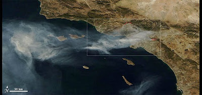 (Credit: Nasa)
Delcan McCullagh, writing on Cnet, adds: 'The images show smoke from the fires being blown west over the Pacific Ocean from a portion of the state stretching from Santa Barbara to Riverside County. They were taken with the Moderate Resolution Imaging Spectroradiometer, which specializes in measurements including cloud cover, ocean color, and water vapor, and has delivered pictures of notable events including Hurricane Katrina and Bangladesh flooding in the past.'
Declan advises another way to view the effects of the fires is to check out the Google Earth maps of the area. Available maps include a detailed outline of the area, homes affected, official warnings, and evacuation orders.
Monday 17 November 2008
Whatever the weather
Hello there map lovers, I wonder if you've ever heard of the National Oceanic and Atmospheric Administration (NOAA) National Data Buoy Center (NDBC), a part of the National Weather Service (NWS).
NDBC designs, develops, operates, and maintains a network of data collecting buoys and coastal stations positioned around our coast.
This from the NDBC website: NWS forecasters need frequent, high-quality marine observations to examine conditions for forecast preparation and to verify their forecasts after they are produced. Other users rely on the observations and forecasts for commercial and recreational activities. NDBC provides hourly observations from a network of about 90 buoys and 60 Coastal Marine Automated Network (C-MAN) stations to help meet these needs. All stations measure wind speed, direction, and gust; barometric pressure; and air temperature. In addition, all buoy stations, and some C-MAN stations, measure sea surface temperature and wave height and period. Conductivity and water current are measured at selected stations.
To support this network and other engineering/data collection projects, NDBC employs engineers, meteorologists, oceanographers, computer scientists, and other professionals. U.S. Coast Guard (USCG) members serve on the government staff to provide unique skills and interface with USCG for transportation support. An NDBC Technical Services Contractor (NTSC) supports NDBC with a staff of approximately 110 employees.
You can view a clickable map of Florida, showing all the buoy stations here. This is what it will look like

From the stations you will be able to get detailed weather information - what you are supposed to do with this information and whether you can do anything about it is another matter entirely!
Friday 14 November 2008
FEMA updates disaster maps
The Federal Emergency Management Agency just updated flood maps in many southeast states, including Florida. FEMA not only changed the maps, but presented the maps online. The organization said the new maps are more accurate, easier to update and are being used by mortgage companies to base loans. The changes will require some homeowners who have never had to carry flood insurance to purchase policies. Others who used to be forced to carry flood insurance policies will be able to drop them if their property is no longer in a flood zone. Flood insurance rates differ from state to state but can cost about $700 to $800 a year. The best way to find out if a resident is in a flood-susceptible zone is to contact an insurance agent. For an interactive map of where you live, such as the Florida one below, click here. It lets you determine the flood and disaster risk of your home town, city or area - from Seattle to Key West - although some areas are more susciptible to such risks than others...


Wednesday 12 November 2008
Hello fellow map lovers,
We all know how precious the manatee is to Florida and the waters that surround it, and do everything we can to promote the protection of this precious animal. Here is a map showing the speed limits for craft around Anna Maria Island, one of the favoured haunts of this gentle beast.
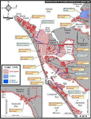
We all know how precious the manatee is to Florida and the waters that surround it, and do everything we can to promote the protection of this precious animal. Here is a map showing the speed limits for craft around Anna Maria Island, one of the favoured haunts of this gentle beast.

For a larger, zoomable version of this map, follow this link
Here's some information on the manatee from wikipedia.
The population of manatees in Florida (T. manatus) is thought to be between 1,000 and 3,000, yet population estimates are very difficult. The number of manatee deaths in Florida caused by humans has been increasing through the years, and now typically accounts for 20%-40% of recorded manatee deaths. There were near 300 registered and confirmed manatees in Florida killed by human activity in 2006; the majority of these, that happened to be discovered by Florida Fish and Wildlife, have been caused by boat strikes.
Accurate population estimates of the Florida manatee are notoriously difficult and have been called scientifically weak; with widely varying counts from year to year, some areas show possible increases yet others decreases, with very little strong evidence of increases except in 2 areas. However, studies carried out in 1997, found that decreasing adult survival and eventual extinction is a probable future outcome for the Florida manatees, unless they are aggressively protected. Manatee counts are highly variable without an accurate way to estimate numbers in Florida in 1996, a winter survey found 2,639 manatees; in 1997 a January survey found 2,229; and a February survey found 1,706. Fossil remains of manatee ancestors show they have inhabited Florida for about 45 million years.
Accurate population estimates of the Florida manatee are notoriously difficult and have been called scientifically weak; with widely varying counts from year to year, some areas show possible increases yet others decreases, with very little strong evidence of increases except in 2 areas. However, studies carried out in 1997, found that decreasing adult survival and eventual extinction is a probable future outcome for the Florida manatees, unless they are aggressively protected. Manatee counts are highly variable without an accurate way to estimate numbers in Florida in 1996, a winter survey found 2,639 manatees; in 1997 a January survey found 2,229; and a February survey found 1,706. Fossil remains of manatee ancestors show they have inhabited Florida for about 45 million years.
So, there you have it, if we want to carry on enjoying the sight of manatees around Florida it is vital that the impact of humans is kept to a minimum. And, as this map suggests, that could start with all boats slowing down in and around the coast where these fascinating creatures live.
Tuesday 11 November 2008
Treasure came at a price
Hello there map lovers!
Check out this map of the routes taken by Spanish treasure fleets in the 17th and 18th centuries. The red marks indicate where the fleets were sunk by hurricanes - all around the southern tip of Florida.
Click here for an interesting and detailed account of the 1715 fleet disaster which befell the squadron of Tierra Firma, under the command of Captain-General Don Antonio de Escheverz y Zubiza, off the eastern coast of Florida. The location is the furthest right of the three red marked areas.
A second Spanish treasure fleet was wrecked in another storm in 1733 and today, the remains of two of the ships - the Urca de Lima from the 1715 fleet and the San Pedro from the 1733 fleet - are protected as Florida Underwater Archaeological Preserves. These ships are time capsules from a bygone era and can reveal much about the history of the mighty maritime system that helped shape the Americas.

Monday 10 November 2008
Has the US got gas?
Hello there. We might have the clearest skies and bluest seas in Florida but how about the rest of the US? Watch this great video from research scientists at Purdue University from something called the Vulcan Project to see the truth about CO2 emissions from our country. It's really interesting stuff.
Sunday 9 November 2008
Sunny weather?
Weather maps are familiar to most people, on the news, in paper, now on the internet and even your cellphone. Check out today's weather in Florida and around the region by clicking here
While you're at it, why not watch today's forecast, courtesy of Yahoo.com by clicking here
Hope it's sunny where you are...
While you're at it, why not watch today's forecast, courtesy of Yahoo.com by clicking here
Hope it's sunny where you are...
Friday 7 November 2008
3D gets mapped
Hello there Florida map lovers. Check out this from internet newswire Cnet.
Microsoft now lets people using its Live Search Maps service get a more immersive view by integrating the company's Photosynth panoramic viewer technology.
Photosynth stitches multiple images together into a 3D view, and people can in effect gaze around from a virtual vantage point. Areas with Photosynth views can be shown in the "explore collections" view of a map that also lets people see photos and other additions to a map.
I found the feature easy to use--even the Photosynth installation that had given me some headaches when I tried it during its early days. I still don't like the vast swath of empty green wasted space that could have been used to make the imagery even more immersive, though, and so far there aren't a huge number of places with Photosynth photos.
For full instructions on how to use Photosynth on Microsoft's maps, check the Virtual Earth evangelist's blog from Microsoft.
In addition, Microsoft said Wednesday it added 47 terabytes of new aerial imagery on Wednesday showing new views of Spain, Japan, Canada, the United States, Australia, and assorted European countries, according to the Virtual Earth blog.
It's really cool. Check out this view of Rod n Reel Pier, Anna Maria
Thursday 6 November 2008
Check out this map from the website http://www.luddist.com/map.html
Juan Ponce de Leon, a Spanish explorer and soldier, is credited as being the first European to set foot in Florida. He also established the oldest European settlement in Puerto Rico and discovered the Gulf Stream (a current in the Atlantic Ocean). Ponce de Leon was searching for the legendary fountain of youth and other riches.

Juan Ponce de Leon, a Spanish explorer and soldier, is credited as being the first European to set foot in Florida. He also established the oldest European settlement in Puerto Rico and discovered the Gulf Stream (a current in the Atlantic Ocean). Ponce de Leon was searching for the legendary fountain of youth and other riches.
Tuesday 4 November 2008
Hello and welcome to my Florida Map blog. I'll be posting news about maps, letting you know of any interesting things I come across and basically inviting your views and comments. I'll also be talking you through some of the many maps to be found on Luddist.com First up here's a really cool link to a site showing how life expectancy in Britain has changed over the period 1992 to 2006. Just follow this link That's all for now, do let me know what you think...
Sunday 26 October 2008
Subscribe to:
Posts (Atom)
